


Stonehome Brewing Co.
CASE STUDY
Stonehome’s brand crafting story
Stonehome pairs quality brews with the warmth of rustic authenticity. With a mission to redefine the brewing scene and create a space where folks can kick back, Stonehome was positioned to make its mark on North Dakota’s ever-growing craft beer scene.
DELIVERABLES
Logo Designs
Visual Identity
CHALLENGE
Distilling the heart of Stonehome into a visual mark that would resonate and establish faithful patrons.
OUTCOME
Stonehome Brewing Co. was able to open its doors with a brand identity that reflected its values and ambitions. The Watford City store’s launch was met with an influx of craft beer enthusiasts. Two years later, Stonehome boldly expanded to Bismarck, North Dakota

warmth & authenticity
Sketch Exploration
Thoughtful and thorough sketch explorations are where things start to take shape. Many custom-type treatment logotypes were roughed out. With the insightful direction of The Brandit, I explored rustic treatments that resonated with the warmth of wood fires and the charm of Norwegian folk art. The fusion of warmth and authenticity served as the backdrop for the compelling story that Stonehome aimed to convey.
This process guided us to narrow down a few options for Stonehome to consider and offer their feedback as we moved to forge the final logo.


Outcome
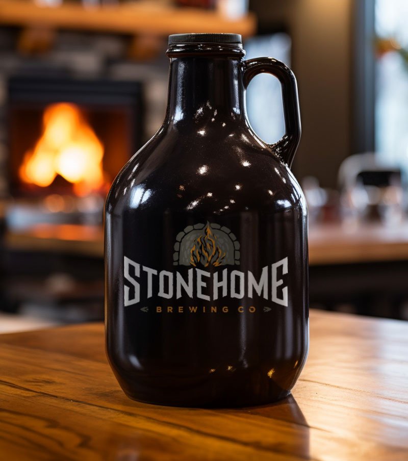
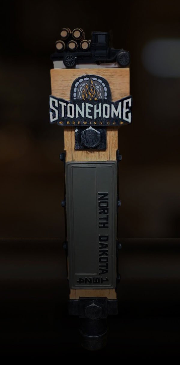
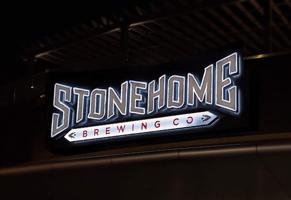
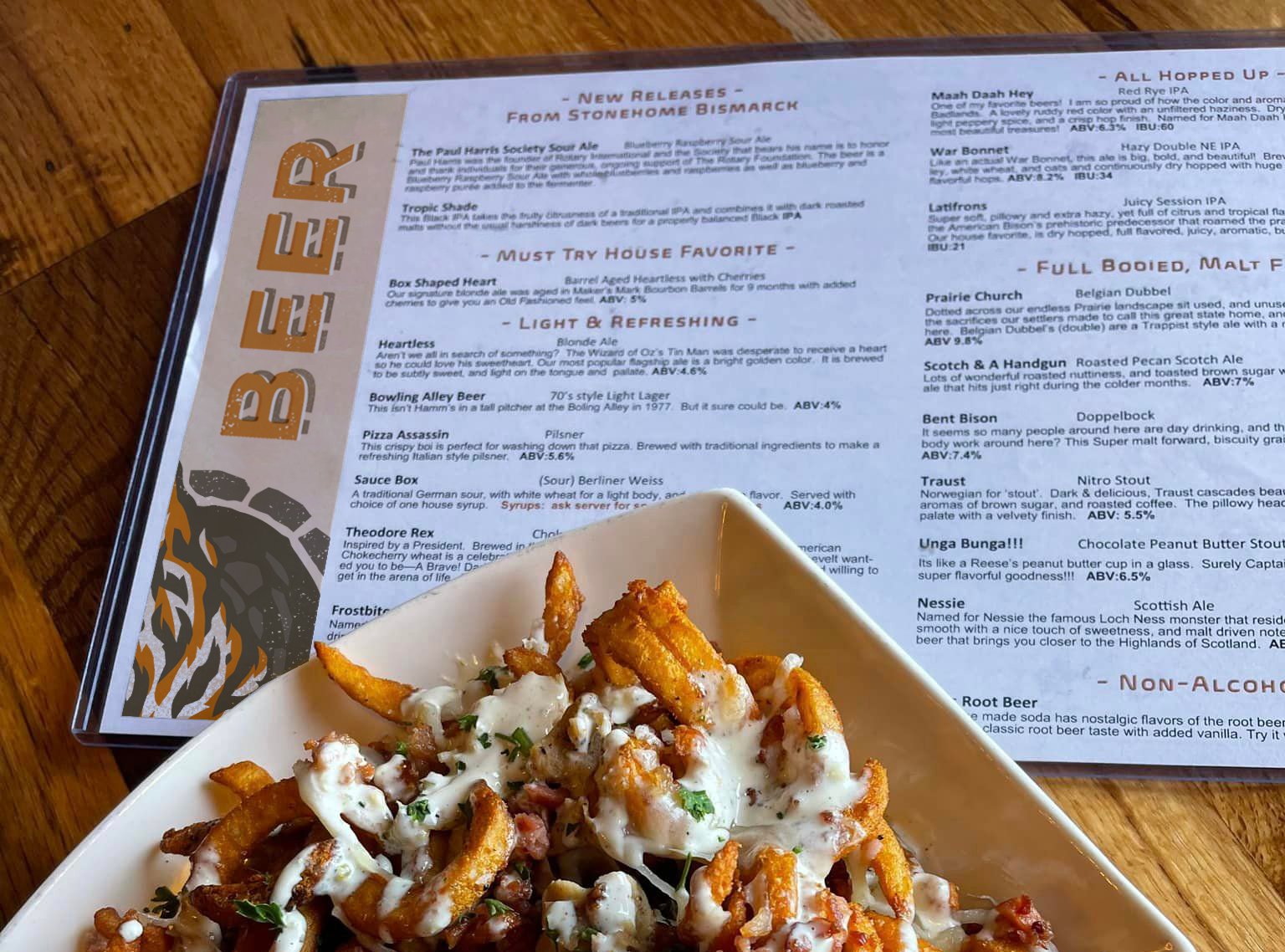
The Stonehome Brewing Co logo mark was established and etched onto everything from glasses to growlers, welcoming patrons into a space where craft beer wasn’t just a beverage, but an experience. The identity system is seamlessly integrated into menus, signage, and tap handles.


Ready to elevate your business branding?