Eeez Kids
Kids face big emotions and busy days, and Eeez Kids envisions body care as more than just cleansing—It is a way to support their well-being. The goal was to create a brand that blends self-care with emotional balance, using natural ingredients and essential oils to help kids feel calm, focused, and energized.
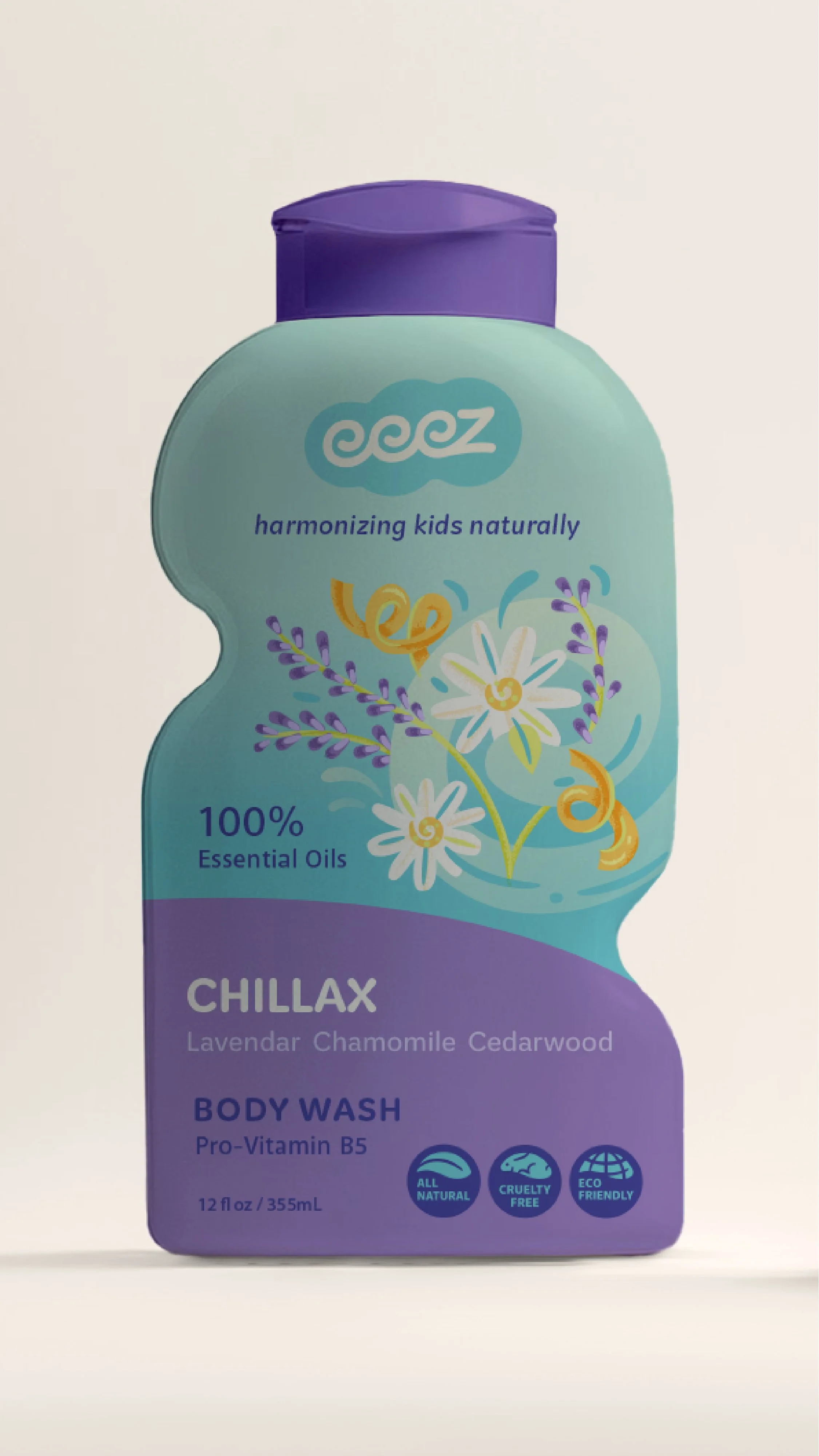
With this vision in mind, I developed a vibrant brand identity and packaging system that captures both the fun and function of Eeez. From the playful yet refined custom-lettered logotype to the thoughtfully crafted body wash line—Chillax, Focus Mode, and Power Up—the brand balances kid-friendly charm with a premium, trustworthy feel. The result is an engaging, meaningful brand that turns everyday routines into moments of care and connection.
DELIVERABLES
Logo Design & Brand Visual Identity
Illustration
Packaging
illustrations and packaging
Bold but not overstimulating
Eeez’s packaging brings its mission to life through custom illustrations, iconography, and bottle design. The graphics flow and intertwine, visually representing how Eeez products wrap around children’s lives with natural, calming care. Essential oil ingredients are highlighted, ensuring parents can instantly see their therapeutic benefits.
The bottle itself is designed for usability, with a soft, ergonomic shape that makes it easy for kids to grasp. Messaging is intentional—every detail, from eco-friendly icons to clear ingredient callouts, reinforces the brand’s natural and ethical commitment.
Visual identity
Bold but not overstimulating
The Eeez brand needed to feel dynamic yet soothing, modern yet warm. Parents seeking holistic, natural care products for their children needed to see trust and transparency in the design, while kids needed to be drawn in by its sense of fun and energy.
The color palette is carefully chosen—bright enough to feel playful, but grounded enough to instill trust. Graphics bring movement and interaction, mirroring the way Eeez supports children’s well-being.
Caring process
Logo Development
The heart of Eeez’s identity is the custom-lettered logo. As always multiple design directions are explored before landing on the final mark, ensuring it captures both fluidity, and structure—a balance between playful energy and calming ease. The signature triple “e” serves as a visual metaphor for motion, care, and comfort, mirroring both the activity of childhood and the need for ease.
To extend this visual language, I developed a supporting system of colors, typography, and illustrations that seamlessly weave together. The result is a design that moves, flows, and interacts, reinforcing the idea of natural, therapeutic care that wraps around a child’s daily routine.
harmonizing visual solutions…
The final identity system and packaging create an approachable, trustworthy presence for Eeez. Every detail—from the custom logo to the bottle design—was carefully created to appeal to both kids and parents. The brand positions itself as a standout in the natural body care market, seamlessly blending fun, functional, and all-natural care into a single, cohesive system.
Ready to elevate your business branding?


